I'm a little late with the sneaks this month....
Thought I'd tell you what I think you'd like about each of the classes I designed:
1. DS - GOOD (layout class) - classic looks of the layouts... vintage stamps and images... making your own foil embellishments... working with Ranger Dimensional Pearls...
2. DS-TEXTURE (layout class) - making your own gritty textured paint (Sharon's secret recipe)...layering with tissue and gel medium...getting your pages dirty - woo hoo!
3. DS - JOURNAL (altered journal) - gel medium transfer on sheers... working with new ten seconds studio metal embossing... the transparency quotes I will custom print for you... tearing your fancy K&Co journal apart... the goldfish...
4. DS - KNOCK (mini album) - making your own album from scratch...the faux woodgrain print cover...the warm colours...paper patchworking...crackle paint and fake rust...making a keyhole from chipboard...
So...see you in April eh?
Monday, March 30, 2009
Sunday, March 29, 2009
Anatomy of a Splat
Layout Title: "Bike + Puddle = Splashin' Good Fun"Wanted to share the fun technique used on this layout -didn't have time to do it in the earlier post. (this one's for you Peggy) Here goes:
The 'splats' in the background (there's actually one big green/blue one and 3 smaller black/silver ones) were made using transparencies, alcohol inks / maya mist, a drinking straw and good old human lung power.
1. Drip various coloured alcohol inks on transparency (I used black and silver)
2. Add a bit of blending solution, then blow in the centre with your straw. (remember doing this in school as a kid?)3. Give a good hard puff if you want those nice skinny streaks. cut to shape to use on layoutI used Maya mist for the large splat 'cos its wetter and so will move around a lot more (less puffing!!!). But it took forever to dry....so I got impatient and just cut it out while wet (dirtying my hands in the process - *tsk* typical sharon) then stapled it wet side down onto the layout - and woo hoo, it actually turned out nice cos the splat changed a bit as it smooshed on the paper.
Really happy with how this layout turned out....and best of all, I had fun.
p.s. if you ask the Auntie at Burger King very nicely, she lets you have as many straws as you like from the dispenser..... just tell her the girl who always buys a bacon crossaintwich with large barley sent you....haha.
Saturday, March 28, 2009
She's a Cutie
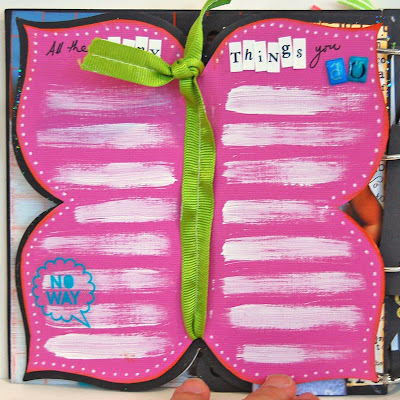
Mini Album: "My Funny Girl" (using Basic Grey mixed page black chipboard album)
We're done with classes for this and so I can show you what the whole album looks like:Love that pout...
I like the phrase "She's a Hoot" next to the owls - cute corny
pacifier + angel wings ... super cute combi
my favourite bit - an extra butterfly page hidden in the album. Traced the edge of the album, then used it to make a mirror image for other side of wing.
Glossy Accents on black chipboard looks really good - shiny black
Cute! Cute! Cute! Now to give it to my sis so she can journal
Thursday, March 26, 2009
Aiyoh So Nice!!! Cannot Tahan!
April is coming and we're gearing up, getting excited, raring to go! And so the countdown to Creative Escape Begins - exactly 1 month to go!
Its NOT too late to sign up - there are a few spaces left! I'd sign up for it if I could , but I'll be working that day.....at the event of course! Haha! Seriously - its going to be really great - I am SOOO looking forward to seeing all 3 talented ladies and soaking up their creativity - see ya.
Here are some sneaks of Tia Bennett's "Pieces of My Heart" class: Woo Hoo! Check out the delicious materials she's working with - SOOO pretty (Ok, its really not like me to gush about prettiness - but I seriously like her choices of materials) Plus this is a cool kit - you'll be able to do this either as a 6X6" album or 6X12" - can't wait to see how she does that!
PLUS!!! Here are sneaks of some of the exclusive limited edition / autographed products Donna Downey will be bringing with her to Creative Escape - so you ladies who have signed up already - you're gonna be the privileged ones who get to snap up these delicious goodies!!! (I've got my eye on her fabric journals...)Its NOT too late to sign up - there are a few spaces left! I'd sign up for it if I could , but I'll be working that day.....at the event of course! Haha! Seriously - its going to be really great - I am SOOO looking forward to seeing all 3 talented ladies and soaking up their creativity - see ya.
Monday, March 23, 2009
Wednesday, March 18, 2009
And The Record Stands at....
Been away at children's church camp with the Critters and hubby. Back now, with something fun to share:
Mini-Album: "For The Record" (Maya Road Chipboard Album)
Challenged myself to see how many Purple Onion stamps I could use and tried to use as little patterned paper as possible for this project. Here's how it turned out. See if you can spot all the stamps!:
And on the back of each page I used phone book paper and stamped some leaves on the side and added details. (Sorry, can't show you the rest - especially the Vital Stats one! Haha)
I really like:
1. How stamping grey on white looks in the background
2. The colour combination - it's 'quiet' nice...
3. Stamping on phonebook paper with grey / black
So For the Record, there are a total of 13 Purple Onion stamps used on this (there are more if you count the separate images from each set):
1. Late 1800s Script Background (my all time favourite, so must have it on the cover)
2. Brocante Set
3. What's the Point?
4. Labelers
5. Stems & Grass Set (not shown)
6. Blossoms (not shown)
7. Leaf Set
8. Bare Tree (not shown)
9. Ribbon Label
10. Date Me
11. 2008 Vintage Calendar Stamp
12. 2008 Vintage Calendar
13. Scallops
Whew! This was fun....nothing like a good challenge to get you going now and then eh?
Monday, March 9, 2009
Grow Old With Me
Layout Title: "Grow Old With Me"
Saw a layout in a magazine that had a double page layout with a vertical orientation. (oh dear, can't seem to remember where now.... anybody remember where?) Thought it was cool and made one to show me and hubby growing together over the years. The thing on the left is supposed to be a timeline (see the clock face?) cum growth chart (see the leaves and the measuring tape?) - corny or what?
Fun Idea to Share:
You can't really see it in my photos but you actually get a very cool effect when you print your photos in black and white onto Basic Grey's 'textured' background paper - you know the ones that have no prints on them? Just grunge. I printed mine on the light grey one - turned out really cool. (You can see a bit of the texture in the photo of me holding the cat).
Hope you're having a good week....its a bit of a gloomy start this dreary Monday.
Wednesday, March 4, 2009
Grandma Gets a Page
Here's a full pic of one of the layouts I did for February's layout class:Layout Title: "Grandmas Can..."
Title and journaling for this was inspired by these books my kids have called "What Mummies Do Best" and "What Daddies Do Best" - very cute.
Favourite Bits:
1. Love the torn bits of story book paper. (I've been recycling the pages from the altered book....can you tell?). Anyway, this is really fun to do - just a bit of tape glue, paper burnished on, and a firm quick rip (think leg wax)
2. Happy with how the heart turned out - I like the mix of ribbons on it especially the lace edging (which is actually elastic for edging underwear according to the auntie at Textile Centre - I bought so much she must have wondered how many panties I was making?!!! Haha)
3. Like how the letters turned out. They started out as hot pink vinyl American Craft Thickers, but I painted them and then sanded them so they turned out much better - The sanding picks out the texture of the vinyl.
That's it from me! Have you been nice to your mummy today?
Subscribe to:
Posts (Atom)